BRAND STRATEGY
VISUAL IDENTITY
BRAND COMMUNICATIONS
PHOTOGRAPHY
FILM
We transformed The Community Channel into Together TV.
The values and ethos of Together, as described in the brand strategy, were something that excited us a great deal. There is a genuine sense of purpose behind the channel - not just to entertain, but to inspire people to get out and do more, help others and make our communities a better place to live. It was a brief that very much chimed with our own ethos of creativity for good and giving back to our communities.
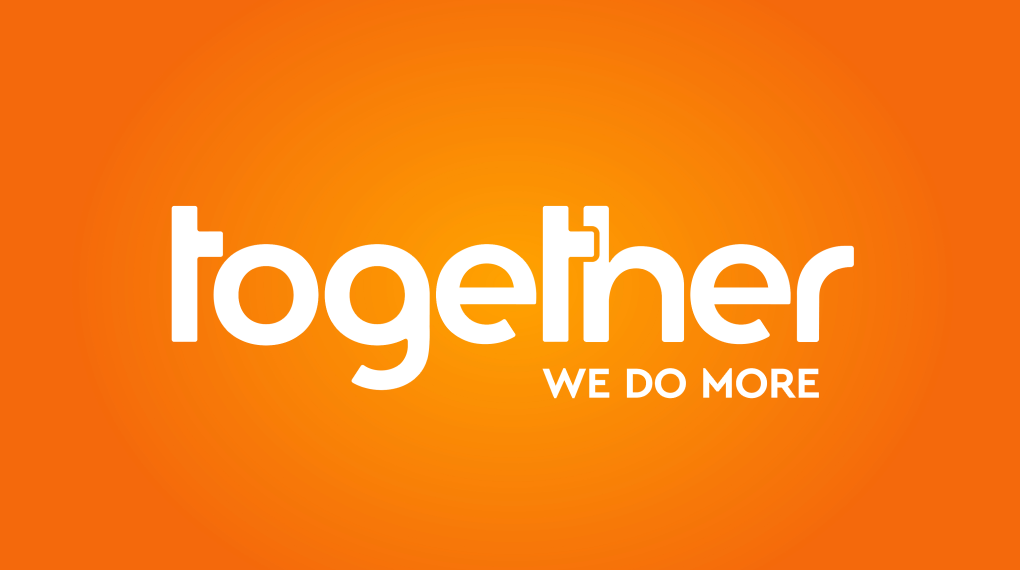
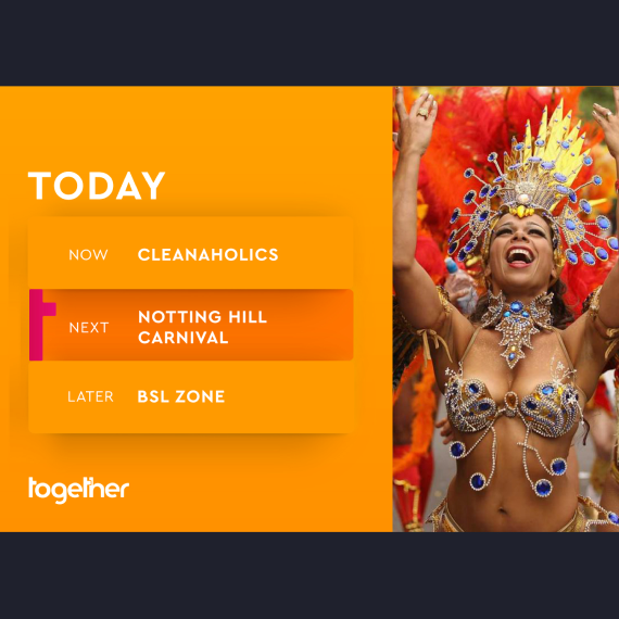
We developed a bright, vibrant, positive and inclusive visual identity for Together.

We created a visual landscape of interlocking, Tetris-like shapes, a visual metaphor for people coming together and becoming stronger, more than the sum of their parts.
The vibrant orange and purple of the primary palette exude warmth and positivity, that we hope will brighten the living rooms of the nation.
The cuddling t’s in the logotype give an added sense of the caring, empathetic ideals of the channel.
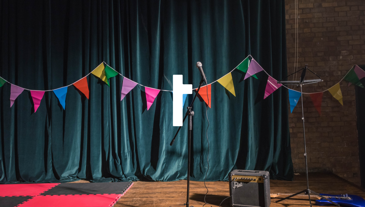
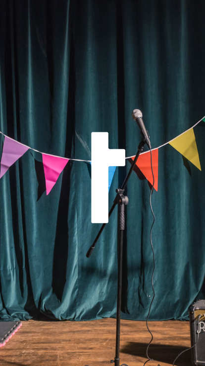
The 't' from the logotype is broken out to form an ownable and recognisable icon for the brand, currently in use across many of the brand's communications.

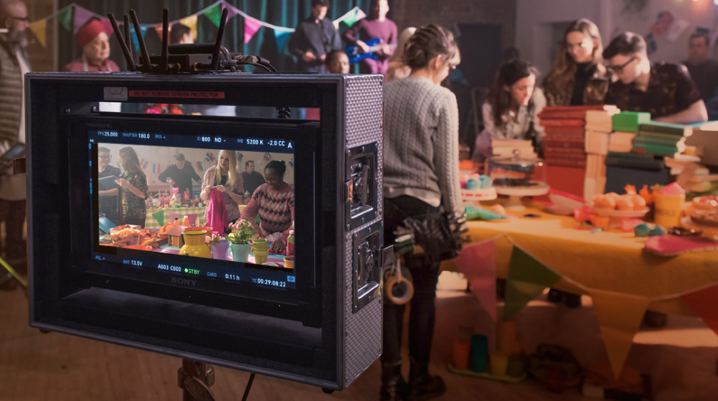
We produced a launch ad for the channel and three 10 second idents that would be seen across the channel’s programming schedule.
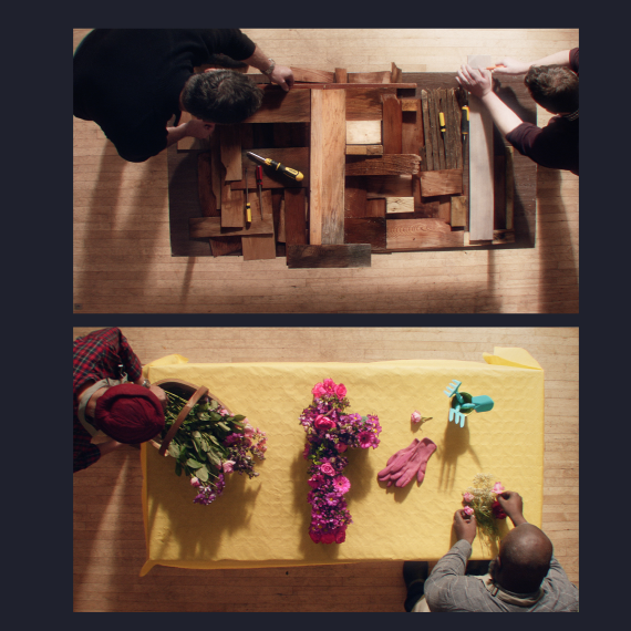
We came up with the treatment and then handed that over to BAFTA award winning Director Michael J Ferns to further refine and then shoot on a single day just before Christmas.
In a visual articulation of the values of the Together brand, the film shows a group of people coming together in a community centre, sharing their interests and passions and working together to build something.
A final overhead jib shot at the end reveals the thing they are making is our ’t’ shape, made up of a collection of objects representing the hobbies and interests of our community group.
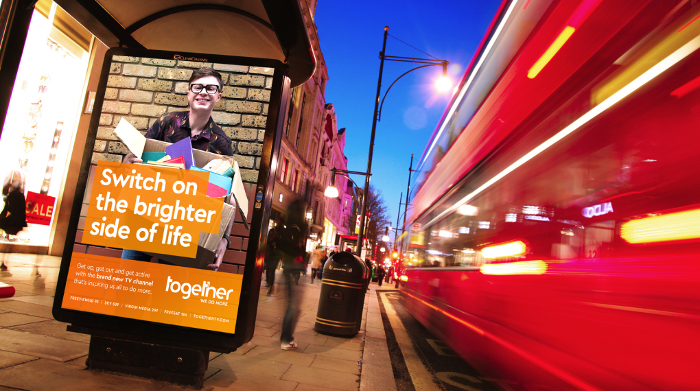
The promo aired across many national TV stations.
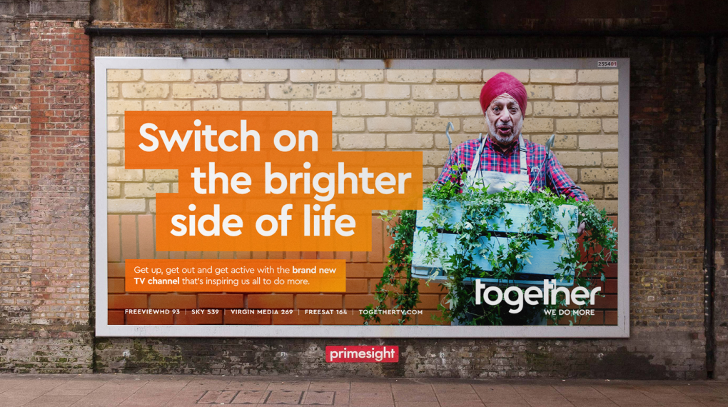
We tasked a photographer with taking some portraits of the cast from the launch film, and combined these with our orange graphics and an engaging campaign line and descriptive copy. We ended up with a range of five executions that brilliantly convey that Together is all about 'real people' inspiring others to 'do more'. The campaign played out across Clear Channel's out of home sites nationwide and across national press.
"The time, love, effort and expertise that Mark, Simon and the rest of the team have put into our new identity has been nothing short of staggering."
- Alex Kann CEO, Together