
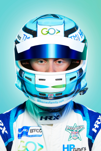
We developed a visual and verbal brand identity, messaging, a website and an array of marketing communications for this residential property developer that’s brimming with personality - family run, in love with the region in which they operate, and obsessed with providing best-in-the industry customer care. They had a love of motorsport, demonstrated by their sponsorship of local hero and British Touring Car champion Ashley Sutton. They also had an interesting penchant for creating marketing tools in the form of decommissioned helicopters and classic VW camper vans.
It’s all these things that gave them genuine standout from the often staid and corporate regional property sector, and offered HeyBigMan! plenty to hang our hat on when it came to developing the beautiful GO brand.
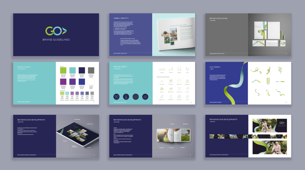
VISUAL IDENTITY
VERBAL IDENTITY
WEBSITE DESIGN
MARKETING COMMUNICATIONS
When it came to the visual identity, we decided to go evolution rather than revolution. Retaining the same basic form and shape of the previous design and keeping green as one of the main colours, we evolved the old logotype and accompanying chevron into a more modern, geometric yet ‘soft’ design, using a folded ribbon as our inspiration.
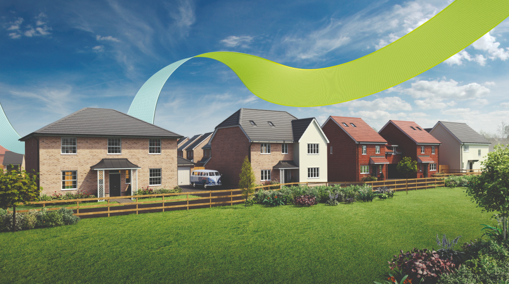
We wanted to create a strong, ownable and adaptable graphic device that would become as recognisable to GO’s audiences as their logo. This took the form of a 3D ‘magic’ ribbon - sweeping across the landscape bringing love and community and beautiful homes to the Herts & Essex countryside.

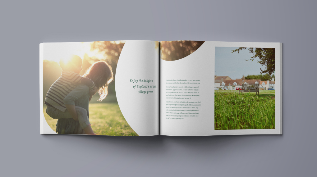
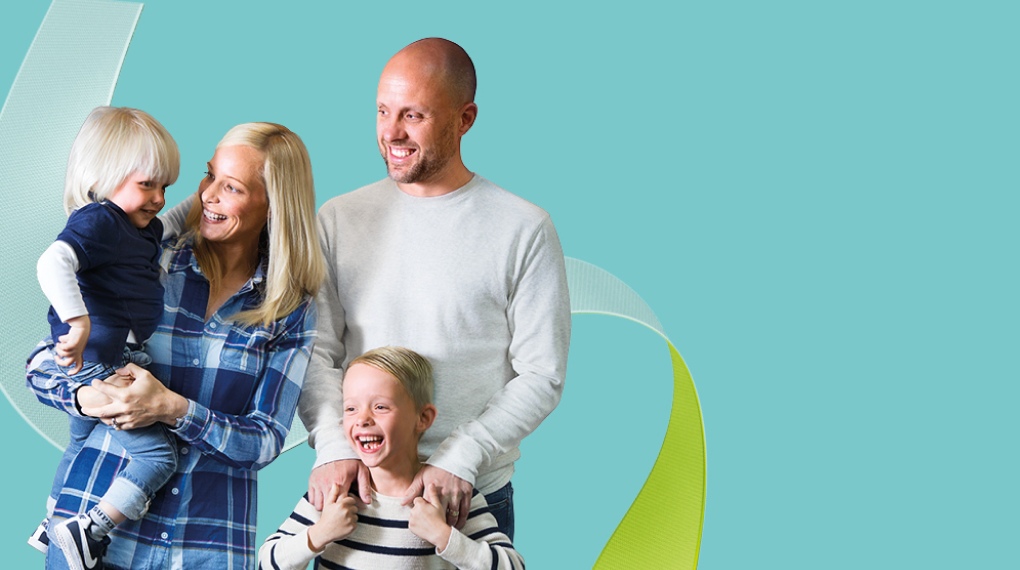
Buying a GO home means buying a lifestyle, so we introduced a photographic style to reflect a mix of the idyllic and the everyday - sun dappled family garden parties to muddy boots at the door. The suite of imagery we amassed brought a real sense of humanity and warmth of the visual identity.
Previously, GO didn’t really have a tone of voice to speak of, and messaging tended to be functional rather than reflective of their unique personality as a business. We created a way
of communicating that is warm, emotive and shot through with a real sense of the life changing importance of what buying a new home means to their customers.
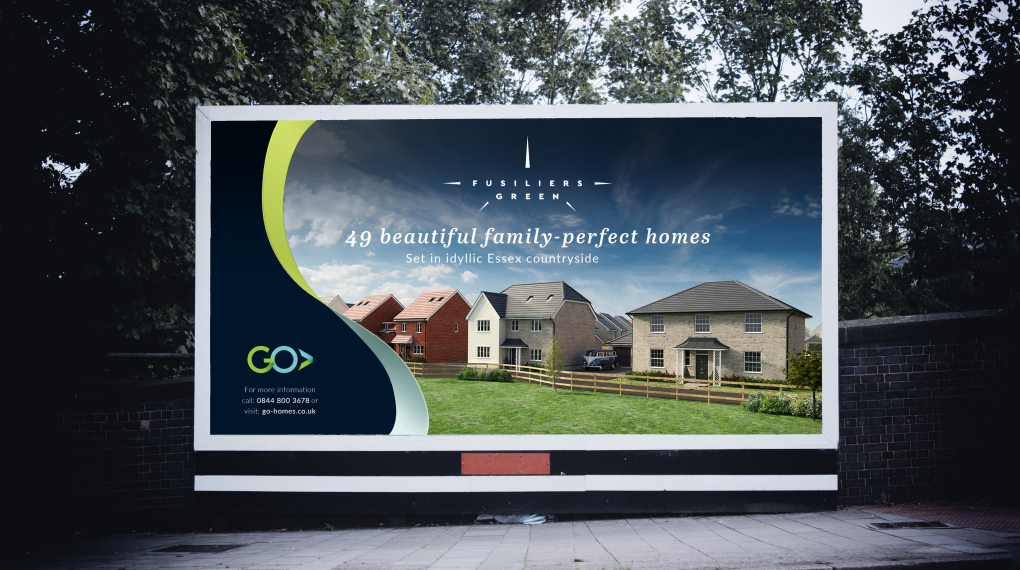
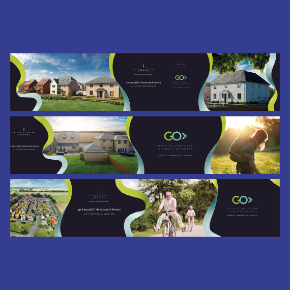
On completion of the master visual identity, GO were ready to take to market their newest development - a 40 property development in the Essex village of Great Bentley. We named the development Fusiliers Green to link into the former Royal Fusilier pub in the village, and the military history of nearby Colchester. ‘Green’ ties into the famous village green, reputably one of the largest in the UK. We designed a logo that nods to the Fusiliers Regiment and the bayonets fixed to their rifles.
A colour palette and fonts were developed and we then blended this mini visual identity with glimpses of the GO branding, but set low in the visual hierarchy, and then applied it all to a brochure, hoardings and online assets.